
Customer self-service statistics
 Verified & Reviewed


 Copy Link
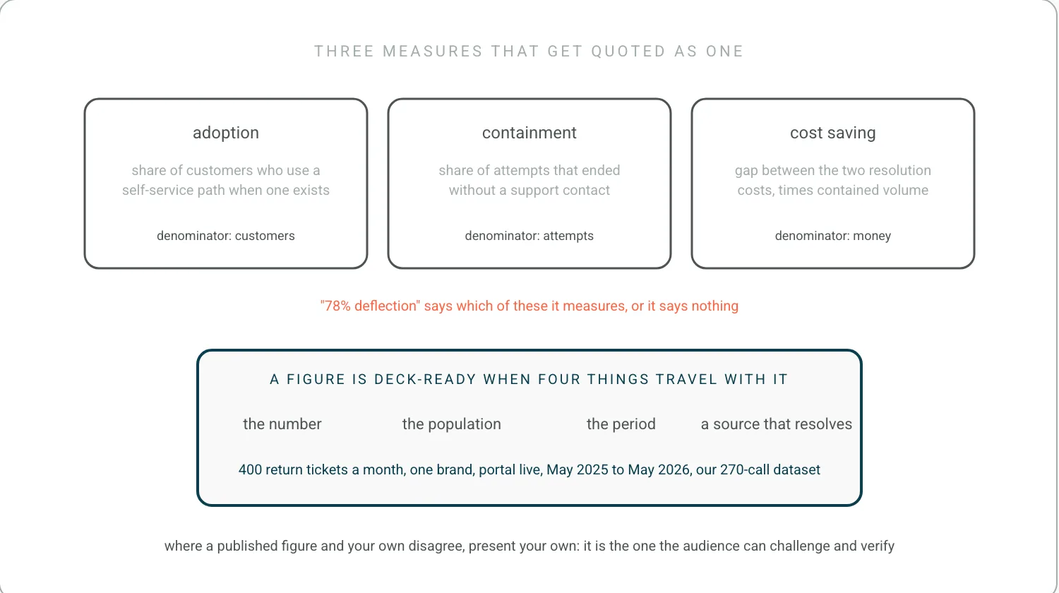
Self-service statistics measure three different things and the figures are not interchangeable. Adoption is the share of customers who use a self-service path when one is available. Containment, often reported as deflection, is the share of those attempts that ended without a support contact. Cost saving is the difference between the cost of a self-service resolution and an agent-handled one, multiplied by the contained volume. A published figure is usable in a business case only when it states which of the three it measures, over what population, and across which contact types. The concept underneath the numbers is customer self-service and the capability catalogue is self-service options.
Structure beats any published per-contact figure
The cost argument is built from two numbers, which are the fully loaded cost of an agent-handled contact and the marginal cost of a self-service resolution. The first includes salary, benefits, tooling, management overhead, and unproductive time, and divides by contacts handled rather than by hours worked. Published figures for it vary by more than an order of magnitude between sources, mostly because they draw the boundary of that overhead differently, which is why the defensible version is calculated from the operator's own payroll and contact volume. Series that do survive scrutiny publish the method beside the number, as the US Census Bureau does with its quarterly retail ecommerce release, and most vendor benchmarks in this category do not. Building the operator's own version is ecommerce benchmark. The second is close to fixed cost divided by volume, which means the saving per contact rises with scale and a small operator's real saving is smaller than a vendor case study implies.
Since the per-contact costs published in this category vary by more than an order of magnitude, the structure of the case matters more than any figure in it. The version I would build has three parts and only three. What you save in ticket reduction, worked from your own contact volume and your own loaded cost per contact, most of which is WISMO. What you save in time people currently spend assembling reports by hand. And what you gain in retention, from customers who would otherwise have left. The first two are arithmetic. The third is the one that makes it worth doing and the one most cases leave out, and its denominator is customer lifetime value. We have built that case with enough retailers now for the shape of it to be settled rather than theoretical, as The SaaS News reported.
For a set of figures that does state its population and period, here is our own. We mined 786 pain points from 270 customer call transcripts between May 2025 and May 2026 and categorized every one. WISMO and delivery delays were the largest customer-driven ticket category, and the teams behind them were spending 15 to 19 hours a month on manual outreach for orders marked fulfilled that had never arrived. Returns were next, running to 5,000 of 21,000 annual tickets at the worst-hit brands, and one brand took 400 'how do I return this' tickets a month with a returns portal already live. That last figure is the self-service statistic worth putting on a slide, because it measures what a portal did not contain, and the population and the period are stated.
A stated preference is not an observed behavior
Preference figures report the share of customers who would rather resolve something themselves than contact a person, and they are consistently high across published surveys. Two qualifications decide whether such a figure supports a business case. Preference is task-dependent, since checking an order status and disputing a missing delivery are not the same decision, and a survey covering all support interactions says little about either specifically. And a stated preference in a survey is not an observed behavior in a funnel. Research groups that watch what people do rather than ask them, such as Baymard Institute, publish both the method and the sample precisely because the two answers differ. The measure that resolves both is the operator's own self-service completion rate by task, which reports what customers actually did rather than what they said they would prefer. The task list is self-service options and the behaviour underneath it is post-purchase behaviour.
The retention figures are the most cited and the weakest
Retention figures in this category are the most cited and the weakest, because the causal claim is hard to establish. The observation is that customers whose post-purchase experience went smoothly repeat at a higher rate than those whose did not, which is real and measurable in any business with reason codes. The inference that self-service caused the difference does not follow, since the customers who needed no help are also the customers whose orders worked. The version an operator can defend is a comparison within the group that did have a problem, between those who resolved it themselves and those who contacted support, which holds the failure constant and isolates the resolution path. The same construction, applied to churn rather than to self-service, is on churn rate in ecommerce.
This is the section where the available statistics are weakest and the reasoning has to do the work. Satisfaction scores on the tickets you handled tell you one thing. The customers who gave up and never came back tell you another, and no self-service dashboard reports on them, because they never used the self-service either. Every order is a promise, and the retention question is not whether the people who asked for help were happy with the help. It is how many people did not ask. Finding them is churn risk and doing something about them is reduce churn.
Follow-on contact rate is the check on every deflection number
The operational set is deflection rate, self-service completion rate, follow-on contact rate, and resolution time compared between paths. Deflection is the one most often reported and most often defined loosely, and the definition that survives scrutiny is contacts per hundred orders by reason code, before and after, read as a rate. Follow-on contact rate is the check on it, since a customer who used the portal and then emailed anyway has been counted as deflected by most tools, and has also been made to work twice, which is the Harvard Business Review finding on customer effort in one sentence. Resolution time comparisons need the same guard, because self-service paths look faster partly by selecting the simpler cases, and the honest comparison holds the reason code constant. Definitions for the set sit with ecommerce KPIs.
A figure is deck-ready when its population, period and source travel with it
A figure is deck-ready when four things travel with it: the number, the population it was measured over, the period, and a source that resolves. A figure without its population is the common failure, since a deflection rate means something different across all contacts than across order-status contacts alone, and the second is usually the one being quoted. A public series that does state its population, such as the FTC's Consumer Sentinel Network Data Book, is worth reading for that discipline rather than for its numbers, which measure reported complaints and not support contacts. Analyst figures carry authority and rarely carry the operator's own conditions, so the strongest slide pairs one published benchmark with the same measure taken from the operator's own data. Where the two disagree, the operator's number is the one to present, because it is the one the audience can challenge and verify. The operating model the whole case is arguing for is post-purchase operations.
Frequently Asked Questions
What are some statistics about customer service?
Plenty circulate and few survive a check, which is what this page is about. A figure is usable in a business case only when it states which of adoption, containment or cost saving it measures, over what population, and across which contact types. Without those three it cannot be compared to your own number, which is the only number the audience can challenge.
Is 90% customer satisfaction good?
It depends entirely on who answered. Satisfaction is measured on the customers who responded, and the customers who gave up and did not come back are absent from it by construction. A high score sitting next to rising churn is the common shape, and it means recovery is working while prevention is not.
What is a common KPI for customer service?
Deflection rate, self-service completion rate, follow-on contact rate, and resolution time compared between paths. Of those, follow-on contact rate is the check on the others, since a customer who used the portal and then emailed anyway has been counted as deflected by most tools and has been made to do the work twice.
References
- Baymard Institute. Baymard Institute. Observed behaviour against stated preference, with the sample published.
- Harvard Business Review. Harvard Business Review finding on customer effort. Why a follow-on contact is a cost rather than a rounding error.
- US Federal Trade Commission. FTC's Consumer Sentinel Network Data Book. A series that states its population, read for the discipline and not the figures.
Ready to Stop Reacting?
The fastest way to see how Keeyu prevents complaints is to see it in action.
In one call, we’ll map your current operations, show how our AI Agent fits in, and walk through real examples of issues fixed before customers notice.
Most teams go live within 48 hours. We never share your data.

