
Ecommerce benchmarks
 Verified & Reviewed


 Copy Link
An ecommerce benchmark is a reference value used to judge whether a business's own performance is good, drawn either from external industry data or from the business's own history. Benchmarks answer a comparison question rather than a measurement one: not what is our return rate, but is our return rate a problem. Their reliability depends entirely on comparability, because category, average order value, geography, and fulfillment model each move post-purchase numbers more than performance does. Which measures to track in the first place is ecommerce KPIs. This page is about what good looks like once you have them.
Internal comparison is the only honest one for speed
The measures compared here are time from order to dispatch, dispatch to delivery, and the share of orders meeting the promise made at checkout. Useful benchmarking in this group is almost always internal, comparing lanes, carriers, warehouses, and seasons against each other, because external figures rarely disclose the promise they were measured against. The series that do disclose it are worth studying for that reason alone: USPS publishes both its service standards and its performance against them, which is what a defensible external benchmark looks like. A same-day dispatch rate is not comparable between a business with a noon cut-off and one with a five o'clock cut-off. Exception rate, meaning the share of shipments hitting a delay, failed attempt, or loss, is the most portable measure in this group.
The internal-comparison point above is the one to act on, and it is worth saying what good actually looks like from the inside. I have looked at a distributed retailer running ninety-five percent on time across eighty-seven store locations, which is a genuinely strong result and the sign of a business that has invested in its operations rather than in its dashboard. The number itself travels badly. What travels is the shape: they knew their own figure, they knew it by location, and they knew which locations dragged it down.
State on-time against the promise, split by lane
This covers on-time delivery rate, delivery-related contact volume, and satisfaction measured at delivery rather than at purchase. On-time rate should be stated against the customer promise, and split by carrier and lane, since a blended figure conceals a single failing route. Delivery experience benchmarks are where external data is most often misapplied, because the marketplace-scale delivery expectations customers hold are set by operators whose logistics economics a mid-size brand cannot reproduce.
Cross-category return rates are close to meaningless
Return rate varies so sharply by category that cross-category comparison is close to meaningless, which is why the useful benchmarks here are internal and structural: return rate by product and by reason, return cycle time from request to refund, the share of returns converted to exchange or credit, and processing cost per return. Reason mix is the most actionable, since it separates returns caused by the product from returns caused by the operation, and only the second group is addressable by post-purchase work. The formula behind the headline number is the product return rate formula and the process is returns management.
Reason mix carries the diagnosis
The comparable measures are contacts per hundred orders, ticket reason mix, first-contact resolution, and support cost as a share of revenue. Support cost as a percentage of revenue is the figure most often quoted at leadership level and the one most sensitive to staffing model and geography, so it should be paired with contacts per order, which is closer to a pure operational measure. Reason mix again carries the diagnostic value, because a business with high contact volume and a WISMO-dominated mix has a different problem from one with the same volume and a returns-dominated mix. The clock that sits over all of them is resolution time.
Audit the definitions before comparing the numbers
An audit establishes whether the numbers being compared are real. The recurring problems are definitional rather than statistical: contacts counted per ticket in one system and per conversation in another, on-time measured against carrier estimate rather than customer promise, return rate calculated on units in one report and on order value in another. Before any external comparison is meaningful, each measure needs a written definition, a single owning system, and a check that the same definition was used across the periods being compared. This is the discipline that separates a usable public series from a quoted number: the US Census Bureau's quarterly retail ecommerce release states its population and its method, and most vendor benchmarks in this category state neither. Customer self-service statistics works through the same test applied to deflection figures.
Here is the audit I would run before comparing anything to anyone, and it takes an afternoon. Take fifty orders from a random day. Follow each one manually through every system it touched, end to end. Count the ones that had a problem the customer never told you about. Following a real order end to end rather than reading a report is the same method Baymard Institute uses to produce its ecommerce findings, and it catches what a dashboard cannot. Most brands have no idea what that number is, and it is the only baseline on this page that is unarguably theirs. I published that audit as a method for exactly that reason, and the wider argument behind it is the one SmartCompany reported when Keeyu launched: most of what goes wrong after checkout is never reported by the customer at all. Ranking what the audit turns up is reasons for customer churn. It also tends to be the moment the conversation changes, because a business that discovers it cannot see its own defects stops asking what the industry average is.
For a sense of what the audit tends to find, here is our own baseline. We mined 786 pain points from 270 customer call transcripts between May 2025 and May 2026 and categorized every one. WISMO and delivery delays were the largest customer-driven ticket category, returns were next, and at the worst-hit brands return enquiries ran to 5,000 of 21,000 annual tickets. Those are not industry averages. They are what operators said on calls, counted, and they are the closest thing to a benchmark for this category that states its method.
Peak ratios are the most valuable and the least recorded
Benchmarks feed planning by converting performance gaps into resource requirements. The standard uses are staffing models built from contacts per order and handle time, tooling business cases built from the cost of the contacts a tool would remove, and peak planning built from the ratio between peak and baseline volume in prior years. The retention half of any such case runs on customer lifetime value. Peak ratios are the most valuable and the least frequently recorded, because they determine whether a plan built on average volume survives November.
Set a trajectory, not an industry figure
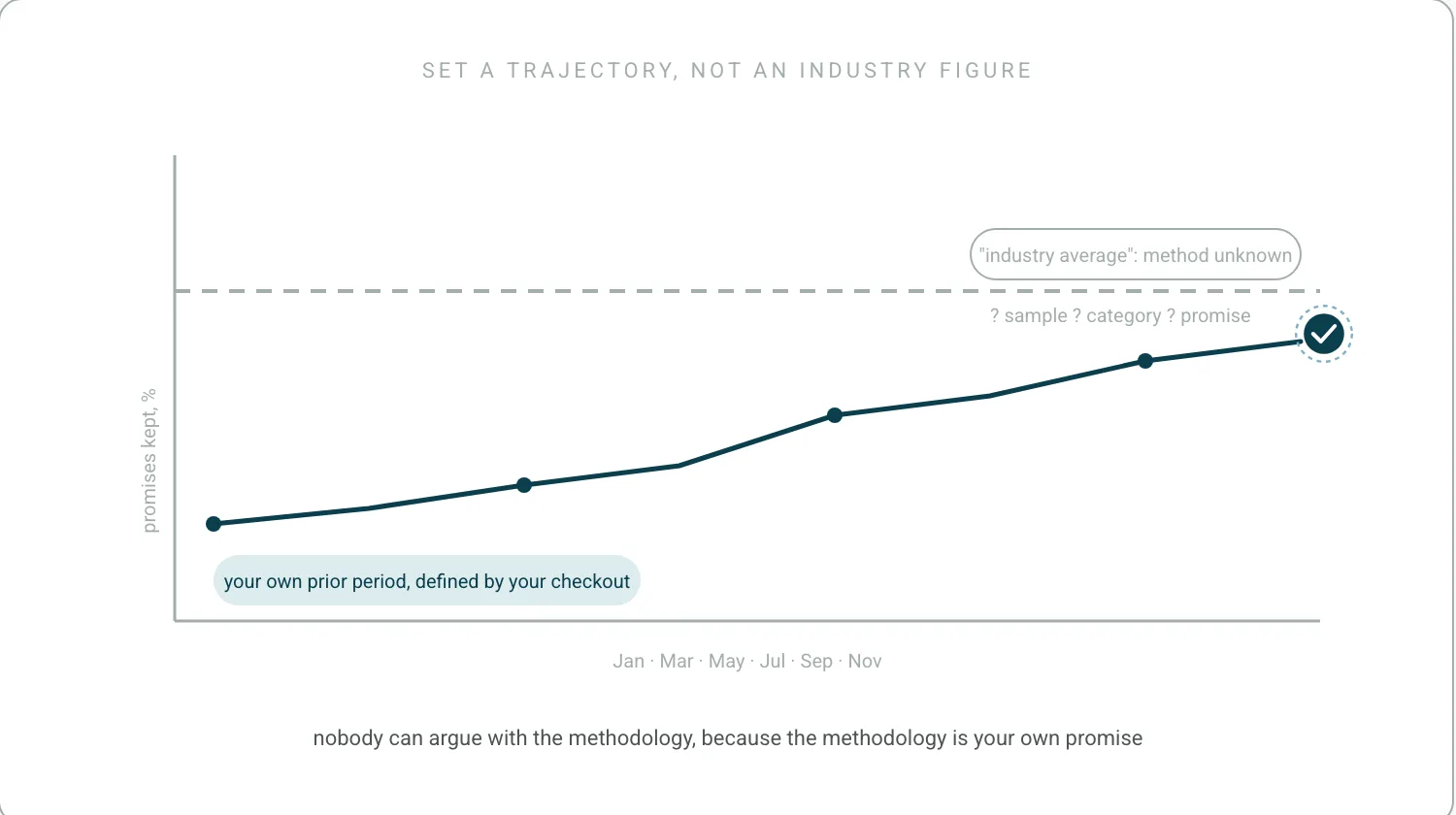
Goals derived from benchmarks work best when they are stated as a rate rather than an absolute, so they remain valid as volume changes, and when they name the measure's definition and source. A goal set against an external benchmark whose methodology is unknown is unfalsifiable, which is a common reason post-purchase targets are quietly dropped mid-year. The more durable pattern is an internal trajectory target, improving the business's own prior-period figure, with the external benchmark used as context rather than as the target itself.
The trajectory target is right, and there is one addition worth making to it. Every order is a promise, and the most durable goal an operations team can hold is the share of promises kept, because it is defined by what the business told the customer rather than by what an industry report says is normal. It survives a change in carrier, in category and in average order value, and nobody can argue about the methodology, because the methodology is your own checkout. Orders arriving on time, as promised, is a target that means the same thing in January and in November. The operating model that makes it an operations goal rather than a slogan is post-purchase operations.
Frequently Asked Questions
What are the KPIs for ecommerce?
The post-purchase set is WISMO rate, on-time delivery against the promise, contacts per order, return rate and its reason mix, and repeat purchase rate. Definitions are on ecommerce KPIs. This page is the next question: what good looks like once you have them, and whether anyone else's number can tell you.
What are the benchmark conversion rates for ecommerce?
Conversion is a pre-purchase measure and sits outside this page, which covers what happens after checkout. The reason it is worth saying rather than answering is that published conversion benchmarks have the same problem as published post-purchase ones: without the population, the period and the method, a number cannot be compared to yours.
References
- United States Postal Service. USPS publishes both its service standards and its performance against them. What a benchmark that discloses its promise looks like.
- Baymard Institute. Baymard Institute. Following real orders end to end as a method, not a metaphor.
Ready to Stop Reacting?
The fastest way to see how Keeyu prevents complaints is to see it in action.
In one call, we’ll map your current operations, show how our AI Agent fits in, and walk through real examples of issues fixed before customers notice.
Most teams go live within 48 hours. We never share your data.

